
A quick post to let you all know of a hand drawn map workshop I’ll be running at Ditchling Museum of Arts + Crafts in Sussex on the 10th March 2018. It’s a day long course including lunch and refreshments in a beautiful studio and there’ll be a chance to see the current exhibition about Elizabeth Friedlander, designer, typographer and occasional mapmaker.
You’ll learn how to make an artist map of your own and the workshop will cover:
– researching your territory with notes and sketches
– simple gridding up techniques
– using negative space effectively with pattern, illustration or stories
– creating decorative compass roses and cartouches
– designing personalised feature icons and keys
– easy to draw but simply elegant hand lettering
– all materials provided
I have regularly written about my love of the hand drawn map (also in my book, ‘Hand Drawn Maps’, Thames and Hudson) and how I feel it expresses a view of the landscape so much more than a digital rendition ever can. By running mapping workshops and teaching others, I now have a far greater understanding of my process alongside the passion.
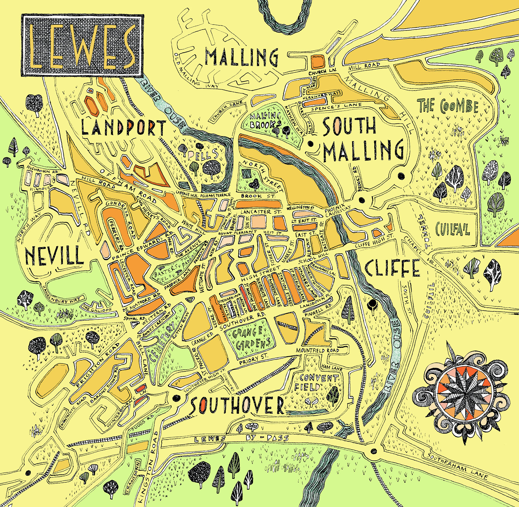
Researching the territory.
Simply put, that means understanding the place you are trying to map. Perhaps it means researching online or from books. But if you want to create a truly rich and personal map, you need to get on the ground, walk the turf, take notes, sketch details, talk to people. A place is always more than simple physical geography.
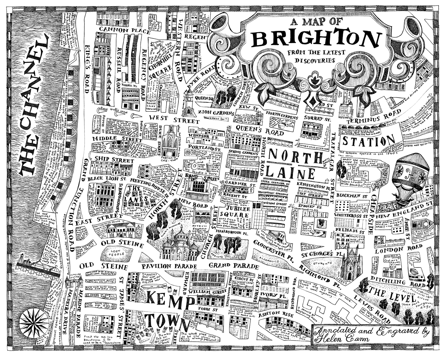
This map of Brighton was filled with notes about the city’s history, old stories and personal observations.
Gridding up.
As I’m not a trained cartographer, I often use other maps as reference to help me create my own. So it’s useful to know how to transfer the basic geographical layout from one paper map (even if it’s your own sketch), perhaps at a different scale, to a second sheet of paper. Generally I use a simple grid technique without tracing paper. As a mapmaker, I’m also the ultimate curator and it’s at this point that I can choose what to keep in and throw out, whether to simplify my map or go all out on the detail.
Negative space.
Negative space is the area that you see between the main features (on any image). On a map it can mean the blank shapes between roads or the seemingly empty spaces between one settlement and the next. In reality, this space is never empty and is filled with people or buildings or wilderness or stories. So how can we express this on a map? Can we use these abstracted shapes to our own artistic advantage?
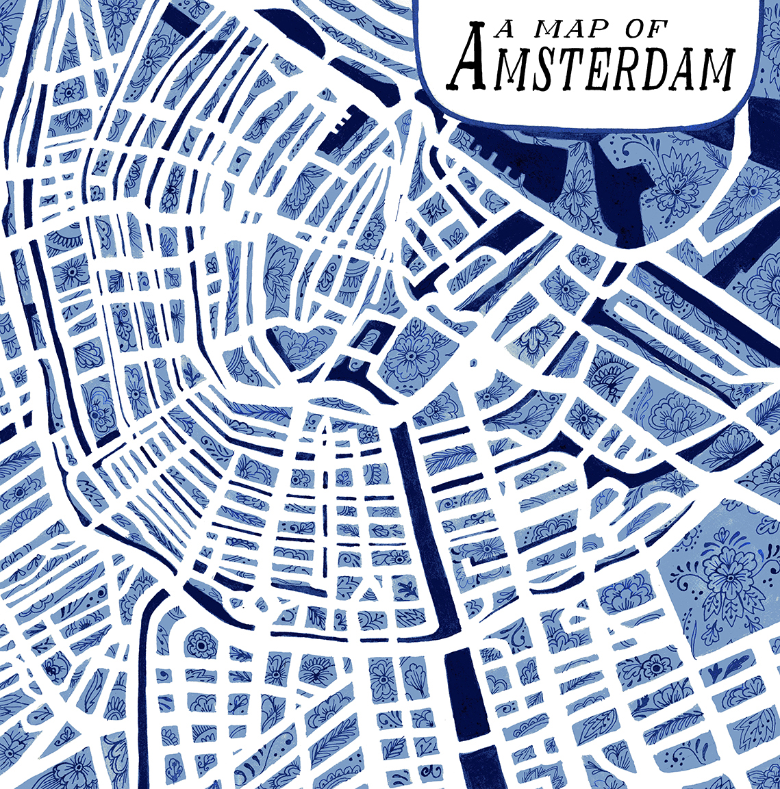
See how the negative space has been given prominence – filled with pattern of a traditional Dutch design. An illustration from my book, ‘Hand Drawn Maps’, published by Thames and Hudson.
Decorative compass roses and cartouches.
There has been a long history of creating beautiful compass roses and cartouches ( the title panel for the map). Early maritime charts, for example, were true status objects and reflecting that, the ‘mapping furniture’ was lavished with intricate pattern and real gold. I enjoy creating both roses and cartouches – they’re a chance for some tour de force illustration or bling. They are the definitive mapping symbol.
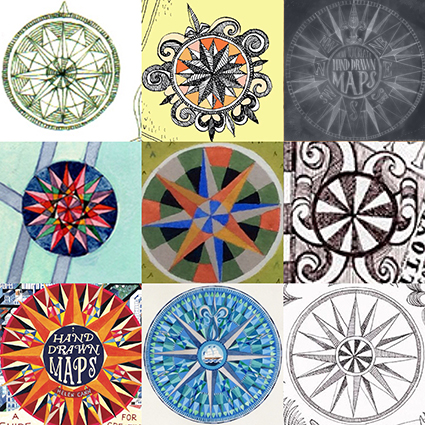
A selection of compass roses I have illustrated.
Keys and feature icons.
Similarly, another element of mapping furniture is the ‘key’ of feature icons – those tiny illustrations symbolising buildings or woodlands, lakes or beaches. Historical mapmakers had a personal language of icons they used to visually code the landscape. For me, these icons make a map truly personal, expressive of both the mapmaker, the time, culture and place. And of course, as ultimate curator, I get to make a decision about what features I symbolise or not.
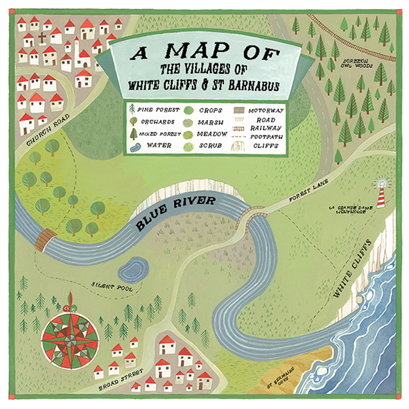
A traditional way to group icons together is in a key as in this illustration from ‘Hand Drawn Maps’.
Lettering.
I relish the beautiful lettering in historical maps. It’s another chance to glimpse the personality of the mapmaker through his handwriting – something that is definitely lost in the bland sans serif fonts of digital maps. I prefer to use hand lettering on my own maps for that reason although that hasn’t always been possible if I have to take publishing demands into account.
Summing up.
So, to sum up, making a hand drawn map is a strange alchemy of form and function, of culturally accepted rule and personal expression. Somehow the mixing of all these things can create a multilayered thing of beauty that is visually exciting and expresses a rich view of a place, its people and history by one particular person at one particular time.
All good reasons to learn how to do it yourself.
Date: 10th March
Time: 10.30-4 pm
Address: Ditchling Museum of Art + Craft, Lodge Hill Lane, Ditchling, E Sussex, BN6 8SP
Telephone: 01273 844744
Email: enquiries@ditchlingmuseumartcraft.org.uk
Cost; £70.00 plus £2.58 booking fee. £70.00 if booking by phone.
Tickets: here.
Hi There, I was just searching for hand drawn map workshops and came across this one you did. Are you doing any more? Or would you need a space to run one?
Thanks
Lotte
Hi Lotte,
Yes, there’s a workshop happening at Towner Gallery in Eastbourne towards Christmas (dates tbc) and another one at Ditchling Museum of Art and Craft in February. Nowhere up towards you though…!
Hello!
Can you please tell me if you have any workshop dates for 2019 set? Thanks so much!
Julieanne
I live in the United States. Is it okay for me to fly and attend your workshop?